
It’s time again for the Friday Face-Off meme, created by Books by Proxy, with weekly topics hosted by Lynn’s Book Blog. The idea is to put up different covers for one book, and select a favorite.
This week’s theme is: A Standout Font
To be honest, nothing immediately came to mind for this concept…but I did just read a rather awful collection of short stories inspired by Oz, and rather than looking up covers for that I decided to go look at covers from the original: The Wonderful Wizard of Oz by L. Frank Baum. Sure enough, there were many, many covers, and some had pretty cool fonts.
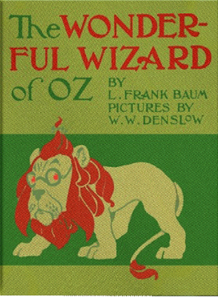
I really like the font on this one, and how the green picks up the Emerald City. Too bad I don’t like the art style at all, especially the characters’ proportions and the lion on his hind legs. I know he walked upright in the movie, but this doesn’t really evoke that, and just feels very off!
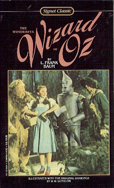
Speaking of the movie – cute picture, and that font feels very fun.
Included this one as an oddity, because you don’t usually see a hyphenated title…
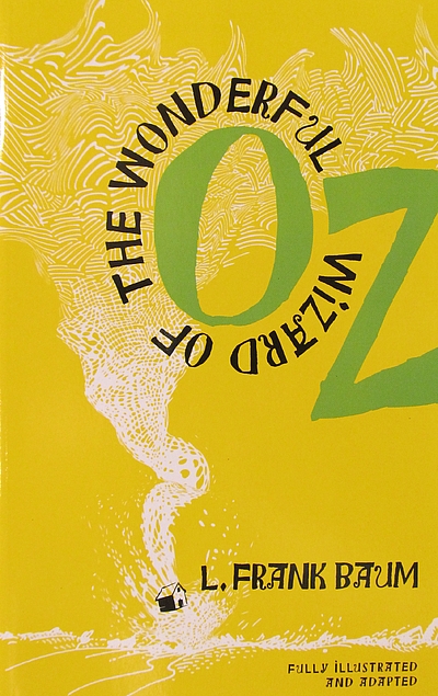
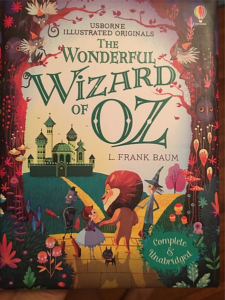
I really like how this one played with the title, with the wrap-around words and the emphasis on Oz. The very simple image is a cool balance to the fun words.
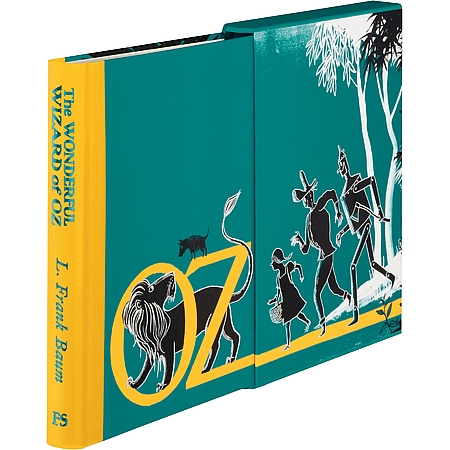
This is my favorite – very different, playing with the box, and doing something fun with the text and the picture together. Plus I like that shiny font on the spine!

I love this – and love the pull out book too.
I keep thinking I should join in on this.. maybe when I’ve got time to look around a bit, though.
I like the movie one – I guess because the picture is so familiar, for one thing – and the last one. I think both are great at drawing the reader in to wanting to read the book.